top of page

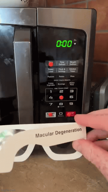
GE Appliances Tactile Kit / Tactile Sticker Kit
In-Depth User Research


Target Research

Low Vision

Blindness
The primary target users for this project are individuals who are visually impaired and
require caregiver support or tactile feedback to facilitate their understanding of interactions.


Blindness Spectrum
By indirectly experiencing the user's discomfort, it is possible to have more empathy in understanding the user.
Strong Contrast Color
Strong contrast color are easier for blind people to distinguish between differnt objects, layouts, and functions.
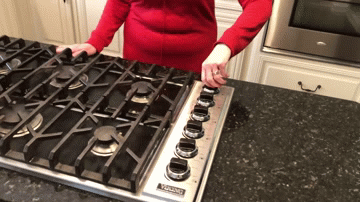
Cooktop
-
Tactile knob
-
Hearing the sound of the gas to recognize which burner is on
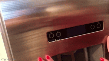
Refrigerator
-
No tactile feedback touchscreen
-
She never used this screen panel
-
Barely can recognize the lights coming from the screen
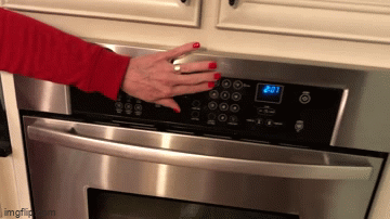
Built-In Oven
-
Attached "Loc Dot" (Location Dot, clear bump sticker) due to the no tactile feedback of touch pad.
-
She had to memorize all the button locations to use the oven.
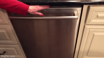
Dishwasher
-
Appreciate the physical/tactile buttons
-
Too many functions/buttons to memorize
-
Memorize one/two specific buttons' location
Our team input 2,751 appliance labels
... and identified the top 538 labels by frequency
_edited_edited.jpg)


Click on the image to view it in larger size.
American Printing House For the Blind (APH)
Since 1858, The American Printing House for the Blind has operated in Louisville, Kentucky as the world’s largest nonprofit organization creating accessible learning experiences through educational, workplace, and independent living products and services for people who are blind and low vision.
Our team has been actively exploring ways to design a user-friendly and intuitive experience for visually impaired people, through consistent communication and feedback, in collaboration with APH. Our goal is to ensure that the design is easy to use, intuitive, and accessible for this specific user group.
Symbol Design Iteration

Tactile

Intuition
In order to improve the design of tactile and intuitive symbols for individuals with vision disabilities, each member of our team independently recorded their thoughts and proposed design solutions on paper. This process enabled us to collectively outline how we can design symbols that are more effective for this user group.


Click on the image to view it in larger size.

Expert Interview & Feedback - Brian Leonard (Central High School, Louisville, Kentucky)
Brian Leonard, a teacher of visually impaired students at Central High School in Louisville, Kentucky, gave us a huge help throughout our research and design iterations.
We reached out to him to gain insights into how visually impaired students learn to read Braille with their hands and how they interact with existing appliances.
As an experienced educator in the field and an advocate for the blind community, his expertise provided us with valuable insights that greatly influenced the development of our accessibility tactile kit.
bottom of page